CureSkin
CureSkin is an app that automatically analyzes a photo to find issues such as pimples, acne, dark spots, scars, and pigmentation. The user is able to chat with top rated dermatologists in India for personalized treatment plans and skin care regimens.
During my UI/UX class, we had the opportunity to form a team at the end of the semester to incorporate everything we had learned throughout the semester and apply it to the redesign of a startup’s app. I had the opportunity to act as the project manager for the groups and designate roles while also being heavily involved in the design process of the app.
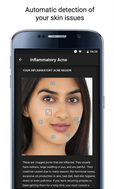
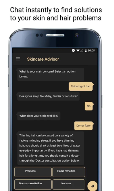
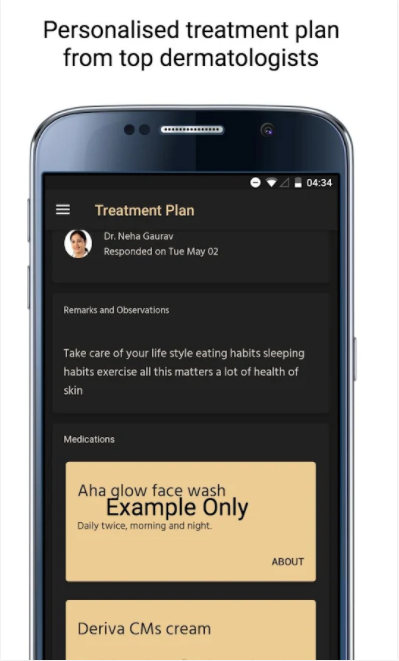
The problem:
The original app lacked an overall theme and was not organized in a way that was intuitive to the user.
The goal:
Our team wanted to unify the overall theme of the application while considering the color scheme and visual hierarchy. We also wanted to deliver the information is a simple way while maintaining a personality through the entire app. Another important goal we had in mind was to make the add appealing to all genders because of the current skincare market being mostly targeted to females. Our design keywords were informative, simple, and personable.
First iteration:
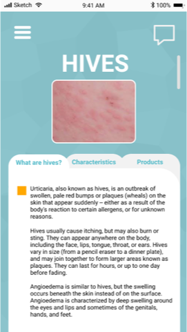
Given the timeframe of the project, we separately created hand drawn mockups of what we thought we would want as a user. We then reconvened to discuss our design choices and agree on features we thought were most important. We wanted to make an organized and informed app in a way that would organize all the information so that the user would not be overwhelmed.
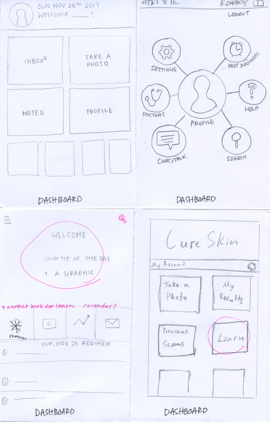
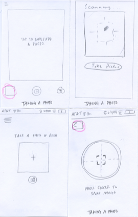
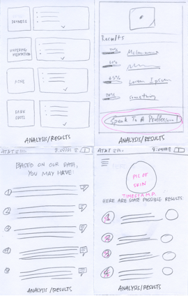
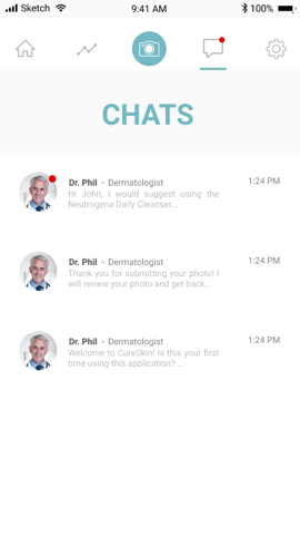
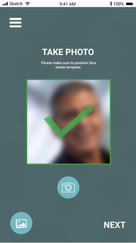
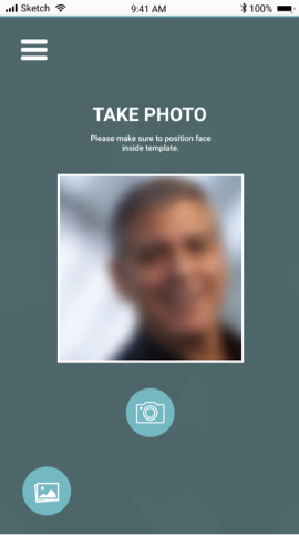
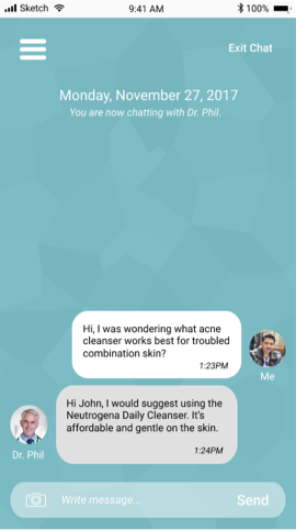
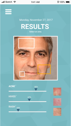
After deciding the features that we liked the most from all the sketches, we made our first iteration of the design of the app.
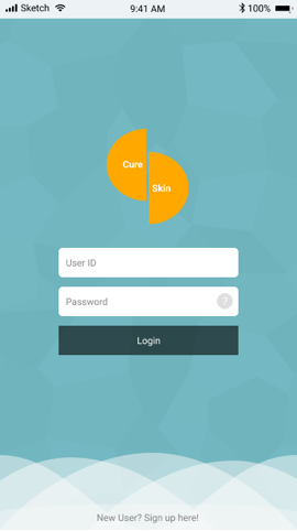
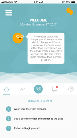
Second iteration:
After our in class critique of the first iteration, we incorporated the following feedback:
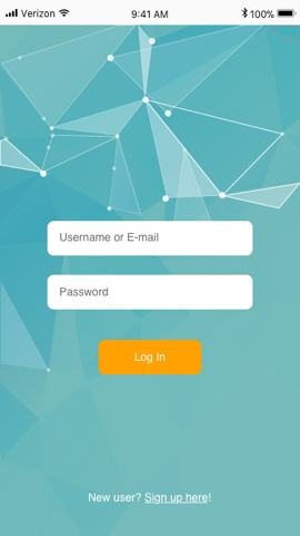
- Make sign up link distinguishable
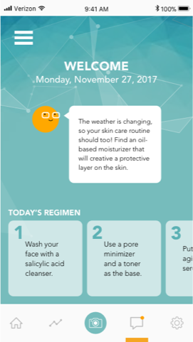
- Keep nav bar at the bottom of the app for learnability purposes
- Emphasizing/popping the skin care regimen we placed on the home screen
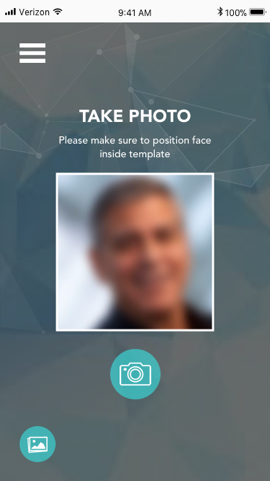
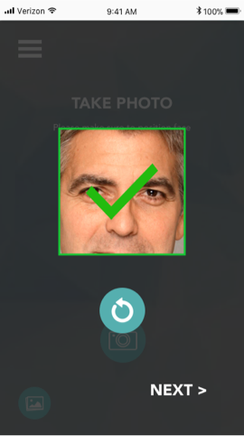
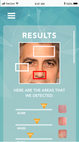
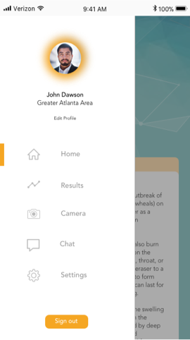
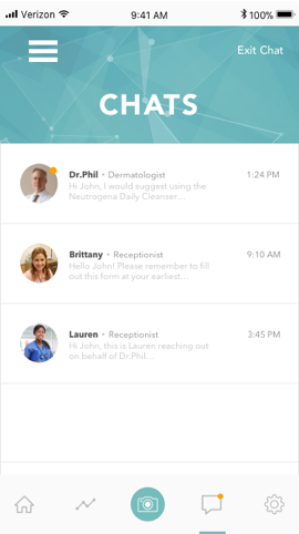
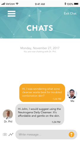
We also tweaked the visual theme of the overall app with the geometric pattern instead of the waves while also adding an option to send results in the chat screen and keeping the inbox/chat screens simplistic and minimal with the white background instead of the geometric one.
User Testing:
Once we had finalized our high fidelity prototype, we conducted our own usability test through a remote user testing service (usertesting.com). This was done by uploading our prototypes on inVision and connecting various parts of the app that they could click on to other screens. We clearly mapped out the introduction, main task they had to complete, and a series of steps in the subtasks. We then asked questions after the test to see what they liked the most about the app and how much they trusted the app. All of our users were able to successfully complete their task of taking a photo and sending to their doctor through the app. Because of how simple we had tried to make the app, we predicted that the user would be successful. Some small tweaks we could make to the app include:
- Writing out tip of the day with the home bot - users thought the small bot on the homepage told them how to treat their skin depending on the weather instead of a tip of the day
- The results page confused a lot of the users because they were not sure how they should be interpreting the percentages - maybe I have hives? Maybe acne? What do I have and what do I not? - having a pop up on the results page explaining how to interpret results would be useful for a first time user
- Alerting the user that their results have been automatically send to their dermatologist would reassure the user that their doctor did receive their results and reinforce trust with the app
- Having the option to search for specific skin care needs would allow the user to get more out of the app
Final thoughts:
Overall the process of designing an app and making it interactive went extremely well. The team dynamics were extremely good - having two designers familiar and adept at Sketch helped speed up the design process of the app. Also having two other members of the team who were more research oriented help us write and improve the user testing portion as well. Having individuals that could quickly understand each other and build ideas off of one another helped the entire process of the project enormously. One of the biggest challenges that we ran into was the difficulty in designing the actual app collectively as a team on a program. Initially we utilized Figma because it was a collaborative version of Sketch. However, we eventually decided to revert back to using Sketch because it was more precise. Another issue we ran into was the wording of the instructions in a way that was understandable by a variety of users.

