DESIGN X HEALTH
Project: Parallel Market
For our CS01320 final project, we were assigned a semester long project building a web application for a client. Our client is Parallel Market, a recently developed startup that is in the process of coming to fruition. The website platform allows people to trade mature but pre-IPO companies by acquiring unicorn shares and then issuing Ethereum tokens per share. Within our four person team, I was the sole designer and also contributed to the front-end development of the project.
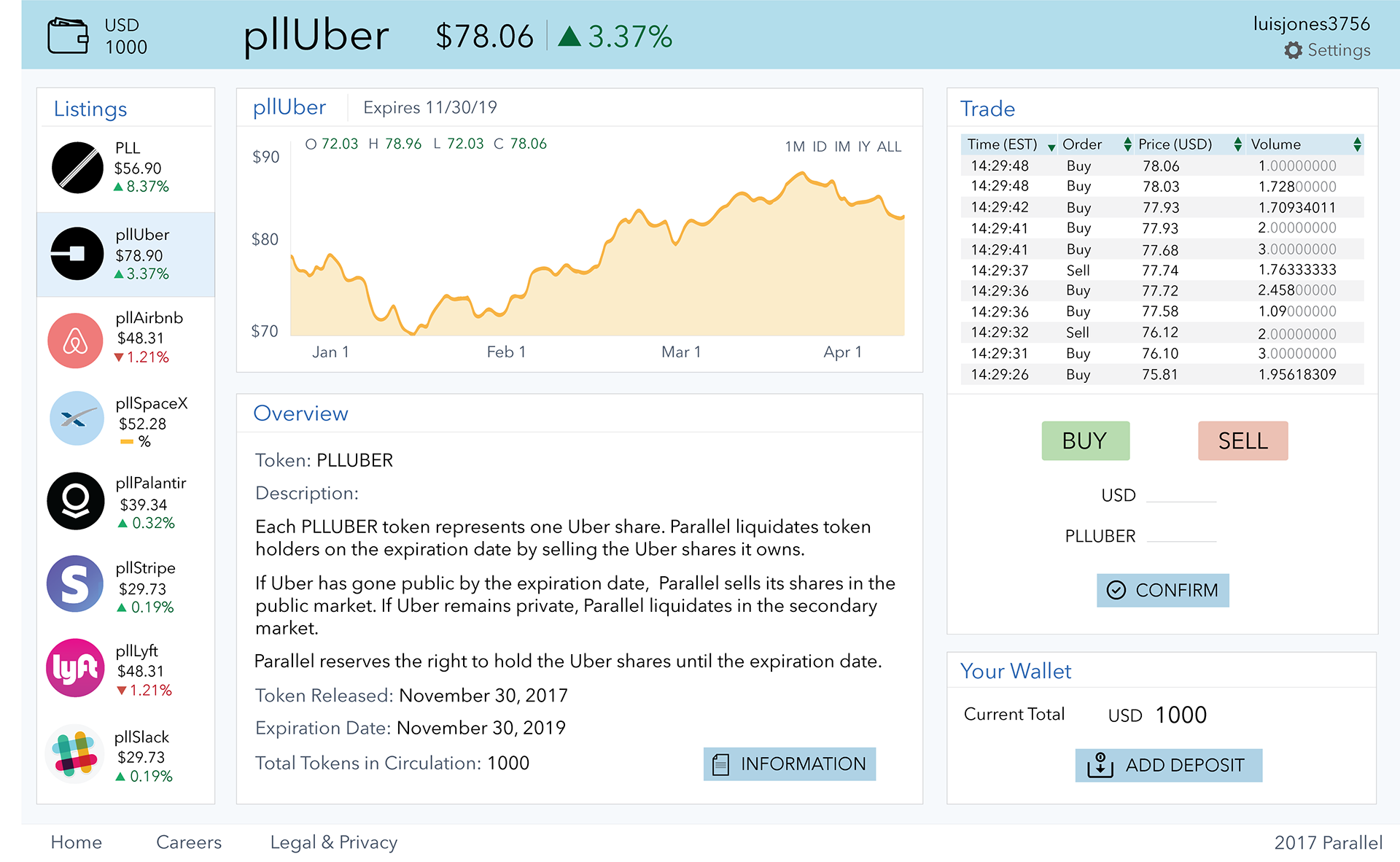
Initial Wireframe:
The image below is the initial wireframe that the client provided us. We first conducted some user interviews to obtain some feedback on the general layout. All of our users said the website was intuitive enough to someone who would trade; however, the platform did overwhelm many users because of the crowded dashboard and being extremely text heavy. Many trading platforms fall into this category of being an overload of information which is why platforms like Coinbase have become more popular due to their simple visual design. There were a couple of repetitive elements on the page and there was a lack of a nav bar linking back to the homepage or any of the other links in the nav bar available on the home page.

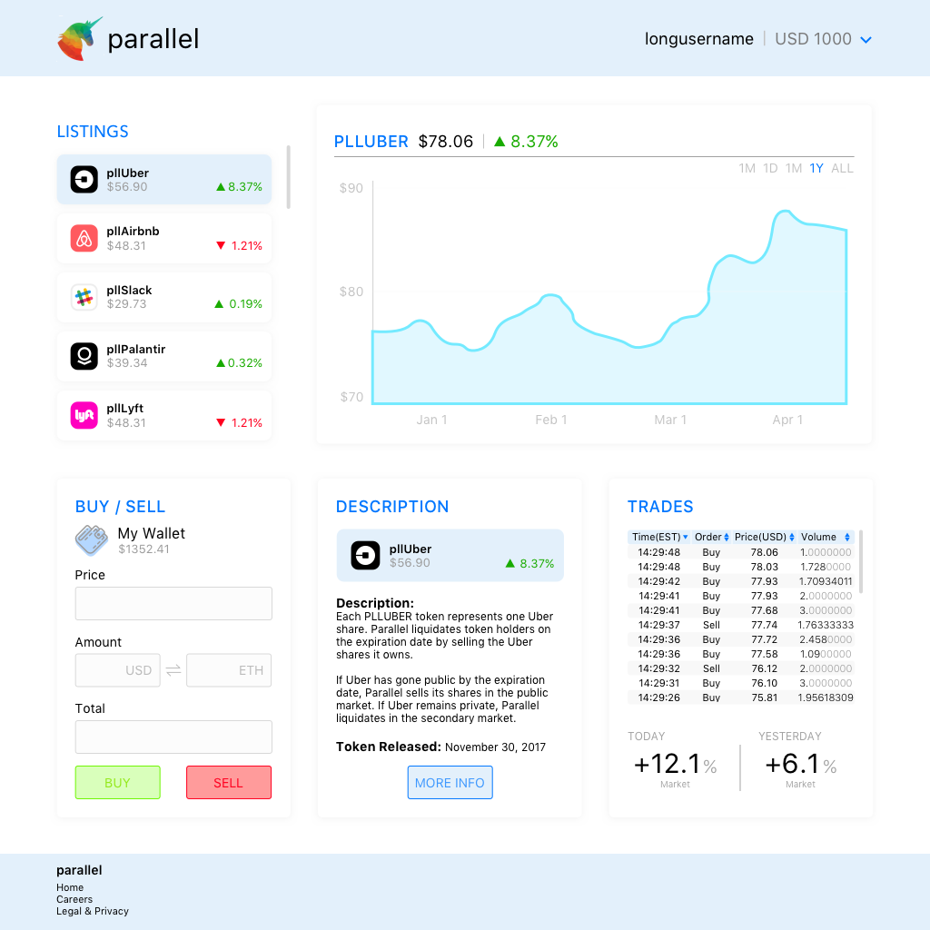
Hi-Fidelity Mockup #1: The image below is my first high-fidelity mockup I presented to the client. In order to simplify the website and give it a uniform visual identity, I decided on focusing in on maintaining a color palette of white, blue, and grey. I really wanted to emphasize minimalism in this platform because of the user feedback be received regarding how cluttered the platform was. I initially started creating my hi-fidelity prototype with a flat design because when flat design is combined with minimalism, it can be an extremely powerful tool. Especially because many design leaders like Apple, Google, Microsoft, etc. are utilizing flat design. Because of the switch from skeuomorphism to flat design, this recent design trend can convey a sense of trendiness that can be used to appeal to young adult users while also simplifying the visual strain on the user. However, I decided to then adopt a semi-flat design because I wanted to create some depth in the website and wanted to remove a colored background on all the panels. Changing it to white with a shadow-effect allowed me to maintain the clean and simple look I wanted to lessen the visual load.
In terms of the panel layout, I chose to make all the panels the same height to make it seem uniform and opted to choose scrolling as the way to access overflow information. When the user clicks the listing, this dynamically changes the graph and the description as well. In terms of information hierarchy, I was constrained by how our client specifically wanted the layout of the dashboard. In terms of the other visual elements that are within the panel, I did not want to diverge too much from the information that the client wanted.
The biggest constraint I ran into while designing this mockup included:
We did not have any method of conducting any user testing in terms of seeing what a user would want or need when trading on a platform like Parallel. Because I personally do not have much experience trading, I was heavily relying on the client's information about what the user would want. However, this is a problem because the client also did not do much user testing and designed the mockup entirely based on their personal preference.

Hi-Fidelity Mockup #2:
The second iteration of this mockup is in the works with our client. Stay tuned! :)

